Having been asked more than once this week, about which brand colour scheme business owners should choose when developing their business branding, the answer is not as straight forward as you might think, so I did a little poking around online and thought I would write this article about what does your brand colour scheme say about you and your business?
Colour is one of the most primitive forms of communication we have. Nature tells us if some thing is harmful – imagine the red and black of a Black Widow spider. Over the course of human evolution man has began to link colour with different emotions.
The use of colour in advertising and marketing sets out to get best advantage from the psychological interpretation of colour. There are the obvious associations with blue meaning cool or cold, like the inside of a freezer – red meaning hot or danger. The physiological association of colour conveys these messages almost instantly in our brain, delivering its message much quicker than the written word.
Lets consider the fast food business. Until recently almost all fast food businesses used a mixture of red and yellow in their colour scheme for branding.
 Red and yellow are colours generally associated with a quickness of pace and efficiency. Nevertheless, McDonald’s has now moved away from this colour scheme combination.
After conducting research it was found that these colour schemes where more associated with slow and bad meals. You will discover now that McDonald’s utilizes a mixture of greens and other all-natural colours to market which conveys a message that it is probably a more healthy choice than other food chains. It has nonetheless kept the golden arches to retain the heritage of its brand but, for now, it stands out for using new colour scheme branding for fast food.
A study by Color Communications Inc discovered that it requires about 90 seconds for somebody to take a viewpoint of a brand. Inside that time, in between 62% and 90% of decisions are influenced by colour alone.
If you get you choose the incorrect colour scheme then your opportunity to make a great initial impression will be wasted. But do not fall into the trap of thinking you have to adhere to the norm. Frequently a challenger brand chooses a colour scheme that is nearly the polar opposite of what people anticipate.
Can you describe your brand in a single sentence?
Our emotional connection with colour is powerful and has evolved over more than hundreds of thousands of years. When selecting your brand’s colour, by all means see what other people in your sector are using, but the very best guidance is to get outside. Nature kicks our ass when it comes to colour palettes.
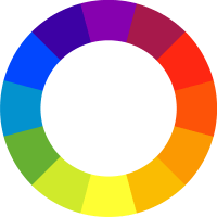
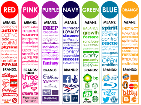
Colour and their meanings:
Blue: calm, stable,steady, trust,believe in, smart,intelligent
Red: passion, immediacy, anger, hunger
Green: soothing, natural,all-natural, envy, balance, stability
Yellow: cheer, attention, interest, fresh, energy, power
Orange: happiness, attraction, wealth, thirst
Pink: caring, love, adore, emotional, sensitive, delicate
Purple: luxury, royal, arrogant, sadness
Black: strength, power, power, energy, elegance, bold, daring
For more information about web design and print talk to the design team at Creative North West